What is Above the Fold?
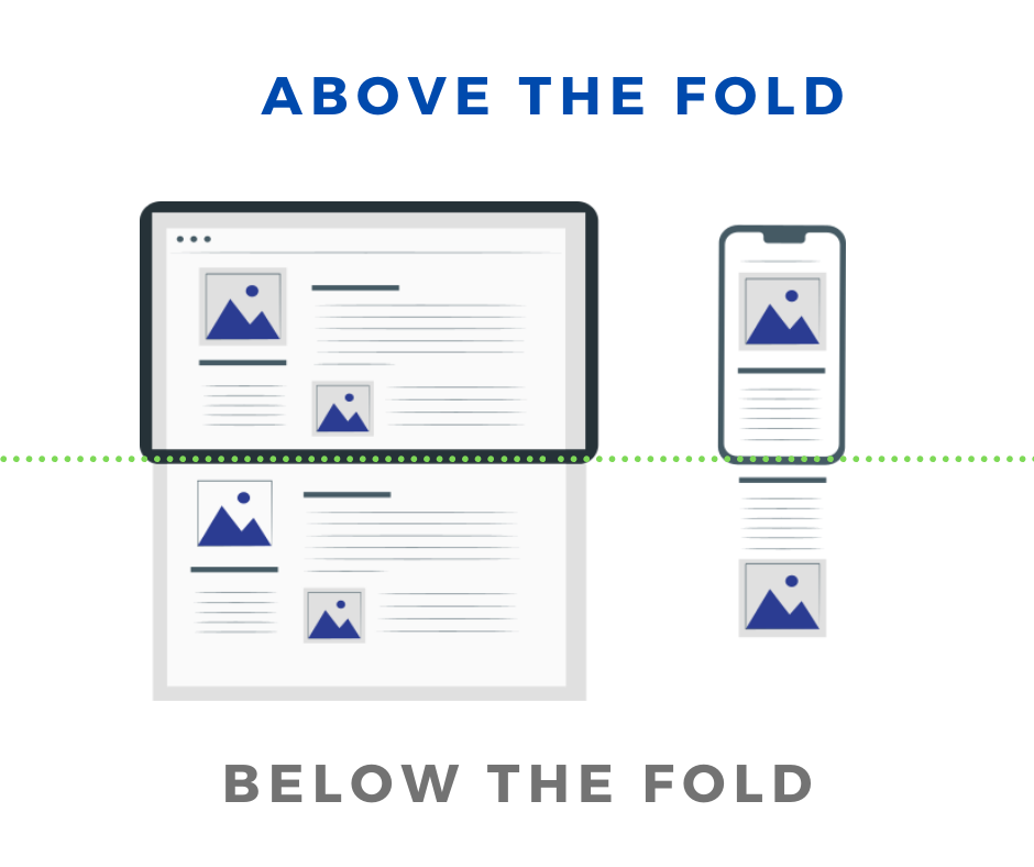
What is above the fold? 'Above the fold' is used to indicate the directly visible part of a web page in a browser window without scrolling down. The visible part of a web page is extra important because this part is also the first impression of a visitor. In a split second, a visitor can decide to continue reading to click away again.

This term 'above the fold' is derived from the newspaper world. Newspapers are placed folded in the racks. Only the part of the newspaper that is face up, ie the part above the fold, attracts the visitor's attention. This section is therefore an important eye-catcher. Above the fold, therefore, there are headlines that attract attention and attractive images that should entice the passerby to buy the newspaper.
The same also applies to websites. There is an increasing choice on the internet and visitors are therefore becoming increasingly critical. Do you want the visitor to read / scroll or perhaps make a purchase? You have to draw that attention and make the visitor think that your site is worth it. Do that in your first intention with content above the fold.
Mobile versus desktop
Above the fold stands for the information given on the visible screen without scrolling. Where the fold lies therefore depends on the size of the visitor's screen. This can be anything, there are several common resolutions and not every visitor watches full-screen. But on an average desktop, the fold is about 1200 pixels high and on a phone usually only 600 pixels in height.
An important difference is the width of the screen. A desktop is much wider, which usually makes it possible to get the most important information in the picture. Many successful websites use this formula: On a desktop you show the most important content directly, on a mobile you keep it clean and you see scrolling as part of the page.


Is Above the fold important to Google?
It seems that above the fold is important to Google. Only Google knows exactly how it works. Google has indicated several times that it is important that important content is immediately visible and should not be pushed 'above the fold'. Granted, Google is mainly talking about ads here.
You also see that many websites that do very well have more content 'above the fold' than websites that rank less well in Google. Google is committed to a good user experience. Perhaps 'above the fold' is not a direct ranking signal, good above the fold content certainly contributes to a better user experience.
Above the fold and website speed
Above the fold is not only an important attention grabber. Above the fold is also important in improving the speed of a web page. Techniques like Critical CSS and key metrics like Largest Contentful Paint (LCP) only look at the above-the-fold content. That makes sense because this content is immediately visible, if there is not something happening in the background at the bottom of the page, a visitor will not notice it. This is not at the expense of the speed with which the visible content is on the screen.
Above the fold tips and tricks
What tips and tricks are there regarding to above the fold?
- Clean and attractive visitors decide in a split second whether they want to scroll further down. Especially on a mobile device where the important actions are almost certainly below the fold, you want a visitor to scroll further. A clear, clean and attractive layout can make a big difference.
- Call to action? Many sites place a Call to action button above the fold of the page. Why? Content under the fold is viewed better than under the fold, so many webmasters argue, visitors are more likely to click on a button or link above the construction.
Does that apply to every site? No of course not. A CTA button after a compelling story will often do better than a CTA button from scratch at the top of the page. You can find out what works best for you by means of an A / B test. - UPCs and explainer . Are you selling a service or service. Then it is a good idea to have your USP (why does a visitor want to buy your product) and explained (a slightly more extensive explanation around your USP)?
- Avoid Ads Google wants content that a user searches for to be displayed directly on the page . Therefore, the Page Layout Algorithm penalizes pages where the content of the page is pushed out by advertisements.
You may not place advertisements 'above the fold'. Yes, as long as the content that is 'promised' from the search results can be found directly on the screen. If you don't, you end up lower in the search results. - Brand awareness Nowadays it is difficult enough to work your way to the top. Good brand awareness helps with this. Therefore always make sure that you place a clearly recognizable logo above the fold of the page
- Show that there is also content below the fold . Sometimes it is not immediately clear that the content of the page below the fold continues. This creates a 'false botttom', a false floor that makes the page appear to stop. For example, by making a background image + text exactly the size of a page.
What about 'below the fold'
Is information below the fold worth much less? Yes and no. Visitors are now used to scrolling. Are you able to make your visitor curious above the fold? Then they automatically scroll down.
A large headline or teaser that can contain much of the visible content is working well in some cases. You then provide little information above the fold.
Still, in many cases it is a good idea to present your main goals above the fold. Especially with informative articles.
Technical seo
a/b testing
Above the fold
Alt-tag
Anchor text
Black hat seo
Bounce rate
Broken links
Canonical tag
Cloaking
Content farm
Crawler
Duplicate content
Structured data
Google algorithm
Google Panda
Google penalty
Google penguin
Googlebot
Crawler Traps
Advanced Search operators
Inernal nofollow
Ranking Signal correlation
Google BERT
Linkuilding
Social Media
Website speed
Time to first byte
First Contentful Paint
Inline CSS
Defer JavaScript
Largest Contentful Paint
Resources
Smart WebFont loading for better performance
Icon fonts lazy loading
Improve page rendering with content-visibility
Analytics without Core Web Vitals delay
Self host Google fonts tutorial